Web animations are a exciting tool that can bring life to your apps and make user experience more engaging, provide guidance or make them more enjoyable. It is a progressive enhancement that is easy to add but hard to get right. ✨
Unfortunately, there are sometimes that we might be tempting to add some extra libraries and animations all over the place that we found “cool” but end up hurting the performance and looking janky to the end user.
Others might say bare CSS animations are too simple and feel too much “static” so adding JS can add more power to have control over those animations, which is not entirely nonsense, but that doesn’t mean we can’t create good transitions with just CSS.
Let’s start small and talk about Microinteractions while learning some important concepts along the way.
Jump to headingBuilding CSS Microinteractions
A microinteraction is a as simple as hovering a button and seeing its color change. In order words, small interactions trigger by a user that provide fast feedback. They’re usually small and subtle, so the user don’t have to wait to see the action happening.
CSS transitions are perfect fit for this use-case.
The transition property tells the browser how to render a change in one CSS property.
It is a shorthand for the properties: transition-property, transition-duration, transition-timing-function and transition-delay.
You can apply a transition in one or more properties, such as background-color, color, transform, opacity and so on.
Here’s an example of a hover transition for our little square:
.box {
  /* ... */
  transition: transform 300ms ease-out;
}

.box:hover {
  transform: translateX(50%);
}
If you play around a little, you will certainly notice a weird thing… If you hover over to the very left of the square, you will see it bumps to the right sometimes, why is that?
This is related to the target area of the box and the fact the we’re applying the transition upon hovering the box itself, so when the box starts to move our mouse/pointer are still in the bounds of the target area of the box and the transition gets triggered again and again.
One possible workaround is adding a short delay:
.box {
  transition: transform 300ms ease-out;
  transition-delay: 100ms
}
Trivial, but what if we want to keep the fast feedback? We can wrap our box and set the hover on the parent instead:
.box {
  /* ... */
  transition: transform 300ms ease-in-out;
}

.container:hover .box {
  transform: translateX(50%);
}
We’ve done our first tiny interaction. Let’s do more! 👀
Jump to headingtransform-origin and combining transitions
Similar to transition, we can add more transform functions to the same element. Some of them are:
scale(x, x) allows us to grow or shrink a whole element in the 2d space.
rotate() specify a rotation by an angle in one axis of the element.
.book {
  transition: transform 800ms ease;
}

.book:hover {
  transform: rotate(-10deg) scale(1.2);
}
Try to hover our little book below:
It doesn’t feel quite right, the book cover seems to be rotating from the center rather the ground, let’s fix that!
.book {
  transition: transform 300ms ease;
  transform-origin: 10% 100%;
}
By applying the transform-origin we change the anchor of the transition to be at 10% (left) and 100% (bottom).
We’ve also reduced the duration of the transition to 300ms for a more quick interaction to the user experience. Much better!
Read more about the Doherty Law <400ms law.
Jump to heading:hover, :active and backface-visibility
translate(x, y) is used to shift an element either horizontally or vertically based on its size.
The following example starts with a given position by having scale and translate functions at the start:
.box {
  transform: scale(0.3) translateY(-30px);
}

.box:hover {
  transform: scale(1) translateY(0);
}
Besides :hover, transitions can also be triggered by CSS :active pseudo-class that gets “activated” when user is pressing down the element.
.button {
  /* ... */
  transition: transform 400ms ease-out 100ms;
}

.button:active {
  transform: scale(0.4);
}
There are transitions can be done in a 3d space as well, like flipping a card:
.card {
  /* */
  backface-visibility: hidden;
  transform: rotateZ(40deg);
  transition: transform 600ms ease-out 100ms;
}

.wrapper:hover .card {
  transform: rotateZ(40deg) rotateY(-360deg);
}
We’re turning the element 40deg by using rotateZ to rotate around the z-axis and rotateY to rotate 100% around its y-axis.
But as you might already noticed, it doesn’t look to be flipping in 3d, and we can’t see the back of the card.
backface-visibility is used make reverse side of the element visible when turned.
.wrapper {
  perspective: 500px;
}

.card {
  /* */
  backface-visibility: visible;
  transform: rotateZ(40deg);
  transition: transform 600ms ease-out 100ms;
}

.wrapper:hover .card {
  transform: rotateZ(40deg) rotateY(-180deg);
}
By moving backface-visibility back to visible, we can now see the back of the card in the transition. We’ve also added the CSS perspective property to the parent element to enable the transform to happen in 3d.
You can think of the perspective value as a measure of how close the user is to the screen. If the user is right next to the screen, small changes in position will appear huge. When we apply a perspective to a container, each child that has transformations will happen in the 3D space.
Jump to headingTiming functions
In CSS animations and transitions we can change how things move in time.
ease-out is one good option to introduce “enter” animations as it seems to be more subtle to human eye notice.
ease-in in the other hand, are commonly referred to introduce animations, but its effect is more related to how things disappear from the screen to the human eye.
ease vs ease-in-out: ease is very similar to ease-in-out, but it isn’t symmetrical. so it feels to be enter slowing and end faster compared to ease-in-out.
Some of these values we just used in the prior examples, but you don’t need to stop here. In fact, most of the time, you would face yourself trying to define your custom easing to have a bouncy effect or something more elastic.
It can be quite challenging to come up with your own easings, but thankfully, browsers today have built-in neat features to tweak easing in devtools:
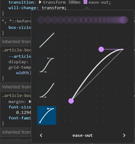
You can EDIT in devtools just by tweaking in the UI, what a super handy feature to have!
And if you’re still not happy with the result, you can check some pre-defined easings here
Jump to headingKeyframe Animations
Transitions are useful, but what if we had to repeat an transition or animate multiple properties in different timings?
@keyframes at-rules are used to applied CSS animations! They can be declare in both from and to blocks or percentages %.
Similar to transitions, the animation property can accept a duration, delay and timing function. You can think of keyframes as a really short timeline or line that goes from point A to point B (so unidirectional) that can be alternate, repeating and triggered with different timings.
We will continue our journey designing micro-interactions, this time taking advantage of keyframe animations!
.block {
  animation: dropIn 5s ease-out infinite forwards;
  animation-delay: calc(var(--order) * 500ms);
}

@keyframes dropIn {
  20% {
    opacity: 0;
    transform: translateY(-20%);
  }

  50% {
    opacity: 0.5;
    transform: translateY(-10%);
  }

  100% {
    opacity: 1;
    transform: translateY(0);
  }
}
As with transitions, we can define a duration, delay and timing function in the animation declaration. Plus, we can add the fill-mode to say what happens when the duration (e.g 5sec) ends. Un this case it keeps iterating through the keyframe.
In the example above, you will notice we’ve added a CSS variable --order to handle the delay of each block. This is useful so the elements don’t show at the same time in the animation but rather at sequential, a staggered animation.
Jump to headingSVG micro-interactions
We can’t talk about micro-interactions without SVG animations, probably the most fun to build!
hover me!svg #handle {
/* Exit transition */
transition: transform 300ms 100ms ease-in-out;
transform: translateY(-14px);
}
svg :is(#left, #right, #mid) {
transition: opacity 300ms ease-in-out;
transition-delay: calc(var(--delay, 1) * 1ms);
opacity: 0;
}
svg:hover {
#left,
#right,
#mid {
opacity: 1;
}
#handle {
/* Enter transition */
transition: transform 500ms 100ms cubic-bezier(0.68, -0.6, 0.32, 1.6);
transform: translateY(0);
}
}
The key to animate SVGs is to animate different parts the icon, one at a time. SVG graphics are often built from shapes like <circle>, <rect>, <line> or just a bunch of <path>'s 😅
Like in the example, we can declare a transition (or animation) for each individual part.
Starting with the #handle, we hide it with translateY and declare an enter transition and exit transition to move it back to normal.
All three #left, #right, and #mid sound sticks are changing their opacity from 0 to 1 when hovering with a delay.
Jump to headingWrapping up
It’s about little details. These same details can make the experience of your app a lot more playful. CSS transitions and animations are way powerful than they might seem.
That’s all for today, but you don’t have to stop here! I hope you’ve found this post inspiring to build more whimsical experiences.
Let your creativity shine! 💫