Responsive web design has come a long way since its inception. With the advent of modern CSS techniques, creating responsive layouts has become more efficient and powerful. However, I still see people using the same old techniques and not fully leveraging the new capabilities that CSS already offers.
Taking some inspiration from henry.codes, in this post, we’ll explore creative ways of achieving responsive designs with new and existing techniques such as regular viewport media-queries, container queries, user preferences queries, and much more.
Jump to headingCSS Media Queries (Macro Layout)
CSS Media Queries is the most familiar form of describing layout on different screens and shapes at a macro level. You will find @media rules that display based on the characteristics of the user agent, output device, or environment. Most commonly seen on device form-factor resolution (device type, screen resolution, orientation, aspect ratio).
Traditional media queries are still essential for creating responsive designs that adapt to different screen sizes and orientations. From media queries, we defined a set of breakpoints for standard device manufacturers: phones, tablets, laptops.
- Mobile:
min-width: 500px - Tablet:
min-width: 550pxandmax-width: 1100px - Laptop:
min-width: 1100pxandmax-width: 1150px
@media screen and (min-width: 550px) {
  .container {
    display: flex;
  }
  .header {
    grid-template-columns: 1fr;
  }
  .footer {
    display: flex;
    flex-direction: column;
  }
}
desktop-first vs mobile-first
It really depends on the project you’re working on and your team’s preferences. If the project is intended to be used primarily on mobile devices, then a mobile-first approach is more suitable.
Which means you start with the smallest screen size and progressively enhance the design for larger screens using media queries. In contrast, if you start from a desktop and scale down to mobile, you might find yourself writing more media queries to handle the smaller screens.
Regardless of your choice, the key is to maintain consistency in your approach and ensure that your design remains responsive across all devices.
Jump to headingmin, max and clamp
These are easiest the most useful CSS functions for dealing with relative values. Those three functions can be used to add a set of bounds (or constraints) to an element rule and proportionally grow/shrink them without having to rely on media queries.
This enables us to handle responsive design without media queries.
Jump to headingmin()
min(arg1, arg2)
.block {
  /*
    This is saying:
    return the minimum value of its arguments
    return 80ch whenever the value on the right is greater
    otherwise return the result of 100% - 2rem
  */
  width: min(80ch, 100% - 2rem);
}
One interesting use case for min() is to dynamically assign a width to a container based on a relative value and have spaces on the sides without using margins.
.smol-container {
  --container-gap: 3rem;
  width: min(100% - var(--container-gap), var(--container-max, 60ch));
  margin-inline: auto;
}
Lorem ipsum dolor, sit amet consectetur adipisicing elit. Ab voluptate pariatur tempora magni eos totam libero qui architecto enim iste!
Jump to headingmax()
max(start, end)
.picture {
  /*
    This is saying:
    return the maximum value of its arguments (opposite of min())
    return 400px on larger viewports and 80vh on smaller (in height)
  */
  height: max(400px, 80vh);
}
Jump to headingclamp()
Clamp is like the good middle ground between the two previous functions, while having the option to define an ideal value where your layout works best.
clamp(min, ideal(flexible), max)
.heading {
  font-size: clamp(1rem, 10vw - 2rem, 3rem);
}
It’s good to mention that these functions can be used for something other than width, height or font-size, it’s not uncommon to see them on padding, margin or other properties too.
Jump to headingContainer Queries (Micro Layout)
Container queries are a type of query that allows you to apply styles based on the size of a container rather than the viewport. This enables more modular and flexible designs, as components can adapt to their own dimensions.
container-type: inline-size; defines a block on the inline axis.
container-type: size; defines a block on both inline and block axis.
or you can just use the shorthand container: feature / size for short.
If you’re not familiar with the concept of inline and block axis, you can check out this article
.feature-card {
  container-name: feature-card;
  container-type: inline-size;

  & .card {
    display: grid;
    grid-template-columns: 1fr;
  }
}

@container (min-width: 500px) {
  .card {
    grid-template-columns: 1fr 2fr;
  }
}
Modern Design
Discover the perfect blend of form and function in our latest collection. Each piece tells a unique story of craftsmanship and innovation.
Jump to headingContainer units
Container units are CSS units available to use that allow you to define sizes relative to the container’s dimensions.
The most common use case is to change the layout of a component based on the internal container’s size rather than the viewport size.
Here is the list of container units and their usage:
cqi: 1% of a query container’s inline sizecqb: 1% of a query container’s block sizecqw: 1% of a query container’s widthcqh: 1% of a query container’s heightcqmax,cqmin: The larger and smaller value of either cqi or cqb
One example of using container units is to create a nice fluid typography and spacing that adapts to the size of its container.
.container {
  container-type: inline-size;
  & p {
    font-size: clamp(0.75rem, 2cqi + 1rem, 3rem);
  }
}
Fluid typography using container units
Jump to headingContainer Style Queries
Container style queries extend the concept of container queries by allowing styles to be applied based on the computed styles of a container. This can be particularly useful for adapting designs based on the context in which a component is used.
Let’s say you have a navigation component where you define the wrapper container and add some CSS variables. You can quickly switch between a set of styles (CSS rules) by querying on the container-specific style value of that CSS variable.
@container <name> style(<variable>)
<div class="breadcrumb-container" style="--variant: arrow">
  <ul class="breadcrumb">
    ...
  </ul>
</div>
@container style(--variant: arrow) {
  li {
    --separator: " ➜ ";
    --link-color: lch(79 59.21 203.28);
  }

@container style(--variant: bordered) {
  ul {
    --border: 1px solid lch(49.61% 17.21 274.39);
  }
  li {
    --separator: " ➤ ";
  }
}
--variant: arrow
--variant: bordered
Jump to headingMedia Preferred Queries
Media queries don’t need to be only about viewport size or device characteristics. Numerous media features can be used to adapt styles based on user preferences and system settings, such as dark mode, reduced motion, and more.
It is not only important to make a more streamlined experience for users, but also to enhance accessibility and usability of the web by adapting to their needs.
Jump to headingColor
@media (prefers-color-scheme: dark | light): it’s a media query used to apply changes based on the operating system picked color-scheme.
@media (prefers-color-scheme: dark) {
  body {
    background-color: #121212;
    color: #e0e0e0;
  }
}
@media (inverted-colors: inverted | none): it is a media feature used to apply styles if the operating system has inverted all colors.
@media (inverted-colors: inverted) {
  [data-theme=light] {
    color: var(--black);
    background: var(--white);
  }

  [data-theme=dark] {
    background: var(--black);
    color: var(--white)
  }
}
@media (prefer-contrast: high | low | forced): it’s a media query is used to apply styles based forced contrast modes.
@media (prefer-contrast: high) {
  .page {
    color: black;
    background-color: white;
  }
}
Jump to headingMotion
@media (prefers-reduced-motion: reduce | no-preference): it is a media feature used to detect if the user has reduced motion preferences set in their operating system. This is particularly useful for users who may experience discomfort with animations or transitions.
@media (prefers-reduced-motion: reduce) {
  .animate {
    animation-duration: 0.100ms;
    animation-iteration-count: 1;
    transition-duration: 0.100ms;
  }
}
Jump to headingTransparency
@media (prefers-reduced-transparency: reduce | no-preference): Similar to reduced motion, this media feature allows you to adapt styles based on the user’s preference for transparency effects. This is particularly useful for users with visual impairments or those who prefer a more solid interface.
@media (prefers-reduced-transparency: reduce) {
  .element {
    backdrop-filter: unset;
  }
}
Jump to headingPutting It All Together
If you take a closer look at the henry.codes website, you’ll see a great example of how different layout algorithms can work great together to create a highly responsive and adaptable design.
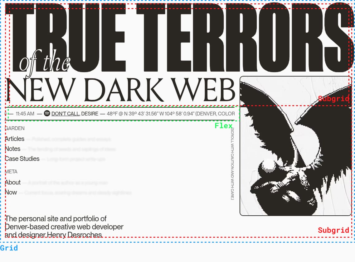
That’s the beauty of it. We don’t necessarily need to lean towards heavy usage of @media queries or flexbox only. Responsive web design has evolved significantly to the point where, with the tools at your disposal, the possibilities are endless.
Responsive web design has evolved significantly, and with these tools at your disposal, you can truly take your designs to the next level.
Finally, let’s take a look at how these techniques can be combined to create a truly responsive design in the example below:
Sally Ramos
@sallyramosProduct Designer at @company. Love to read, play and meditate in my free time.
15k Followers • 7k Following • Since April 30, 2017
(You checkout the code of this component here)
Give it a shot! Mix and match CSS functions such as min(), max(), and clamp() with container queries and style queries to create something unique and responsive.