Did you ever have a hard time trying to override a CSS of an element? We got this beautify website where we were happy by adding simple selectors and structuring our stylesheets until the team or the product owner decided crank up the site to include widgets, surveys and a bunch of third-party tools.
Suddenly, our design doesn’t fit anymore, and updating those third-party styles becomes a battle of selector’s specificity and !important uses. I think we’re all been there at some point.
Thankfully enough, CSS has got some amazing new features recently, being one of them: Cascade layers
Jump to heading What is Cascade?
“The CSS Cascade is the way our browsers resolve competing CSS declarations.”
In other words, it is what determines which styles get apply to an element. The cascade is the algorithm for solving conflicts where multiple CSS rules or declarations apply to an HTML element. It is about conflict resolution.
h1 {
  font-size: 18px;
}

/* vs */

.title {
  font-size: 24px;
}
But to decide which one gets used we need to understand the steps of the Cascade:
Jump to heading Order of appearance
Order of appearance refers to the order where the rules are defined, and how they appear is taken into consideration by the cascade. A rule is a combination of a selector + block of declarations.
/*
Selector: .component
Property: background-color
Declaration: background-color: slateblue;
Rule: .component { background-color: slateblue }
*/
From CSS rules, declarations to <style> or <link rel='stylesheet'> tags, they’re more likely to end up in the final cascade the further down they are.
/* main.css */
h1 {
  color: green; /* this declaration gets overwritten */
}
<head>
  <link rel="stylesheet" href="main.css" />
  <style>
    h1 {
      color: red; /* by this one */
    }
  </style>
</head>

<body>
  <h1>hello world</h1>
</body>
Jump to heading Specificity
Specificity is an algorithm used to determine which CSS selector is most specific. That is, it decides which style is stronger in terms of weight compared to other selectors that apply to the same element.
The specificity weight can be expressed as a group of three elements from highest to lowest: (A, B, C)
- A: IDs
- B: Classes, Pseudo-classes and attributes
- C: Elements, Pseudo-elements
Given any CSS selector like:
button[type='button'] {}
You can intuitively calculate as: (0, 1, 1)
Then, compare to another selector for the same element:
/* (1, 1, 0) */
.button#get-started {}
Given these scores for this example, the last selector gets applied. It is like a game the one with the higher points in specificity wins.
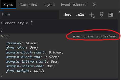
Jump to heading Origin
When we talk about the origin of CSS, we’re talking about exactly where these styles come from.
CSS rules can be defined in many places or referenced in different stylesheets, such as:
- User-agent: Default browser styles;
- Local user: Operating system-based or application preferences styles;
- Author: Your styles;
Jump to heading Importance
Importance isn’t there to simply increase power — but to balance the power between various competing concerns. It is about in which circumstances our styles get applied.
This includes:
- Transitions
- Animations
!important
Both animation and transition properties are designed to have a higher priority to define the current styles of an element. For instance, a fadeIn animation can manipulate the visibility of an element since the current and final opacity value will override its value by default*.
On the other hand, the !important flag is the one that will override all other selectors regardless of their weight in specificity. It is like a signal that we want our declaration to be higher in the Cascade.
/* wins */
button {
  border: none !important;
}

/* does not matter order or specificity */
button#my#highly.specific[data-selector] {
  border: 1px solid green;
}
*What about inline styles?
Inline styles are styles added via the html
styleattribute that will override pretty much all other CSS declarations unless!importantis defined. You can express their specificity weight as 1-0-0-0.<style> body button { display: block; } </style> <!-- button will be hidden --> <button style="display: none;"></button>
Jump to heading Cascade Layers
Cascade Layers are layers of contained specificity. They can provide more control over the cascade system.
Layers can be declared using the @layer at-rule.
@layer reset, base, layout, components, utilities;
When you declare CSS in cascade layers, the order of precedence is determined by the order in which the layers are declared.
- reset
- base
- layout
- components
- utilities
Based on the previous example:
@layer reset {}
@layer base {}
The first layer (reset) always has the least specificity, while the last layer (base) will have the highest specificity amongst all named layers.
A single layer can be used multiple times throughout the cascade. Cascade Layers stack in the order they first appear. That means, even if you add another @layer statement for an existing layer it won’t touch the order of precedence of that layer.
@layer base {
  p { font-size: 16px; }
}

@layer layout {
  p { font-size: 18px; }
}

/* some more code */

@layer base {
  article p { font-size: 24px; }
}
For the above example, the paragraph size will still be 18px regardless of the order and the specificity of our new selector. If the same element is being targeted on both the base and layout layers and has conflicting declarations, such as font-size in both layers rules, the last declared layer takes precedence and wins the battle.
Following the same line, declared layers can contain nested layers as well:
@layer components {
  @layer button {}
  @layer accordion {}
  @layer slider {}
}

/** or **/
@layer components.button {
  button {
    /** ... **/
  }
}
Jump to heading @import
One of the most exciting features of Cascade Layers is the possibility to import entire stylesheets into new layers:
@import url("path/to/normalize.css") layer(reset);
@import url("path/to/bootstrap.min.css") layer(bootstrap);
Then we can extend or override element’s styles without having to worry about how these external stylesheets are internally targeting these elements.
@import url("normalize.css") layer(reset);
@import url("bootstrap.min.css") layer(bootstrap);

/** No more struggle with overrides :) **/
@layer theme {
  button {
    display: inline-flex;
    align-items: center;
    font-family: inherit;
    font-weight: 700;
    min-height: 44px;
    border-radius: 0;
  }

  button:hover,
  button:focus-visible {
    box-shadow: none;
    outline: 2px dashed slateblue;
    outline-offset: 2px;
  }
}
Jump to heading Layer vs unlayered
Earlier, I mentioned that the last declared layers have higher specificity between “named” layers because this rule applies to any style under a layer. But we could also define styles outside of layers, or unlayered styles per se.
@layer typography {
	h1 { color: slateblue; }
}

h1 { color: turquoise; }

/* Result: h1 color will always be turquoise */
Unlayered styles are always more powerful than layered ones no matter the order. This works because layers don’t add priority the same way !important do, instead, they remove priority in relation to unlayered styles.
Instead of increasing or decreasing specificity for each selector rule, cascade layers allow us to manage the cascade without just grouping them. The specificity algorithm still applies, but now to resolve conflicts within each layer.
Jump to heading Layers and importance
When a style that is inside of a layer is marked as !important its weight in the cascade increases and inverts the order of precedence.
Sounds confusing? Let’s break it down:
@layer first {
  .paragraph {
    color: red !important;
  }
}

@layer second {
  .paragraph {
    color: blue !important;
  }
}
Assuming we have those two layers targeting the same paragraph element and modifying its color with the !important flag. As we saw earlier, this flag adds priority over the next or previously defined rules over the same property, so the order suggests the last color declaration color: blue.
However, the !important will flip the order of layers so @layer first has priority over the @layer second giving the paragraph a red color.
Jump to heading Cascade Layers and Frameworks
Fortunately, Cascade Layers now have good browser support, so we can start considering how to use them in our projects. With an understanding of how cascading layers work, let’s explore how we can take advantage of them in today’s front-end development landscape!
We’ll be using cascade layers essentially to better organise your CSS by splitting it into many layers and help organise the CSS architecture.
Suppose we have a bootstrap of a brand new React project:
.
├── App.css
├── App.jsx
├── assets
│   └── react.svg
├── main.jsx
├── pages
│   └── home
│       ├── Home.jsx
│       ├── home.module.css
│       └── index.js
└── styles
    ├── global.css
    ├── reset.css
    └── theme.css
In the application entrypoint main.js we import our usual reusable/global stylesheets:
import "./styles/reset.css";
import "./styles/global.css";
import "./styles/theme.css";
We can then start by looking at the reset.css stylesheet rules, our first and lowest priority layer:
@layer reset {
  *,
  *::before,
  *::after {
    box-sizing: border-box;
  }

  html,
  body {
    height: 100%;
    margin: 0;
  }

  img,
  picture,
  svg {
    max-width: 100%;
    display: block;
  }

  /* more code ... */
}
Next, global styles are basically our base styles for our application where we can already define some good defaults in its layer:
@layer root {
  /* Theme styles and Base system */

  :root {
    /* Typography */
    --text-xsm: 0.75rem;
    --text-sm: 0.875rem;
    --text-base: 1rem;
    --text-lg: 1.125rem;
    --text-xl: 1.25rem;
    --text-2xl: 2.5rem;
    --text-3xl: 3.75rem;

    /* Colors */
    --blue: hsl(204, 72%, 74%);
    --neon-blue: hsl(237, 100%, 70%);
    --deep-blue: hsl(208, 37%, 20%);
    --white: hsla(0, 0%, 100%, 0.87);
    --red: hsl(0, 68%, 68%);
    --yellow: hsl(48, 57%, 74%);
    --black: hsl(0, 0%, 14%);
    --gray: hsl(0, 0%, 60%);
    --purple: hsl(237, 41%, 35%);

    /* Sizes */
    --sz-sm: 0.5rem;
    --sz-base: 1rem;
    --sz-md: 1.5rem;
    --sz-lg: 2rem;
    --sz-xl: 2.5rem;
    --sz-2xl: 3rem;
    --sz-3xl: 3.5rem;

    /* Fonts */
    --font-title: Inter, Helvetica, sans-serif;
    --font-body: system-ui, Arial, sans-serif;
  }

  :is(h1, h2, h3, h4, h5, h6) {
    font-family: var(--font-title);
  }

  p,
  div,
  span {
    font-family: var(--font-body);
  }

  body {
    line-height: 1.5;
    color-scheme: light dark;
    font-synthesis: none;
    text-rendering: optimizeLegibility;
    -webkit-font-smoothing: antialiased;
    -moz-osx-font-smoothing: grayscale;
    -webkit-text-size-adjust: 100%;
  }
}
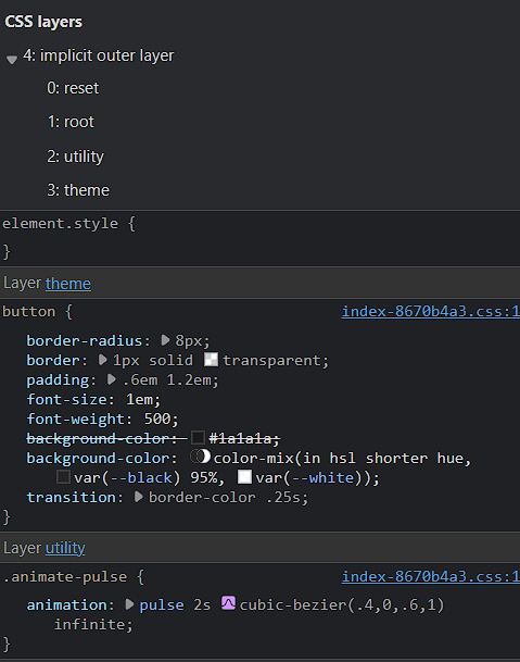
Last but not least, we define our actual theme implementation in a new layer:
@layer theme {
  body {
    color: var(--white);
    background-color: var(--black);

    display: flex;
    place-items: center;
    min-width: 320px;
  }

  a {
    font-weight: 500;
    color: var(--neon-blue);
    text-decoration: inherit;
  }
  a:hover {
    color: hsl(237, 86%, 64%);
    color: color-mix(in hsl shorter hue, var(--neon-blue) 95%, var(--white));
  }

  h1 {
    font-size: var(--text-2xl);
    line-height: 1.1;
  }

  button {
    border-radius: 8px;
    border: 1px solid transparent;
    padding: 0.6em 1.2em;
    font-size: 1em;
    font-weight: 500;
    background-color: hsl(0, 0%, 10%);
    background-color: color-mix(
      in hsl shorter hue,
      var(--black) 95%,
      var(--white)
    );
    transition: border-color 0.25s;
  }
  button:hover {
    border-color: var(--neon-blue);
  }
  button:focus,
  button:focus-visible {
    outline: 4px auto -webkit-focus-ring-color;
  }

  @media (prefers-color-scheme: light) {
    :root {
      color: var(--deep-blue);
      background-color: var(--white);
    }
    a:hover {
      color: var(--neon-blue);
    }
    button {
      background-color: var(--white);
    }
  }

  /* ... more code ... */
}
We’ve just structured and declared our styles in three manageable layers that we can extend without worrying about competing CSS rules.
From now on, you’ve got to pick your desired approach for components and pages. Cascade Layers doesn’t solve CSS scoping, and since the new @scope at the time of this writing is still in the early stages, you might need to pick a CSS-in-JS solution or use CSS modules for that need.
For example:
/* home.module.css */

.homePage {
  /* ... */
}

.hero {
  /* ... */
}

.cta {
  /* ... */
}
What about third-party stylesheets? What if we need some utility-first tool like Tailwind?
Straightforward enough, we can just import it to our global styles in a new layer called utility:
/* global.css */
/* previous layers ... */
@layer utility {
  @tailwind base;
  @tailwind components;
  @tailwind utilities;
}
The layering order now becomes:
- reset
- root
- utility
- theme
The reason our theme is the last layer is because its first declaration and appearance only happens in theme.css which is the last stylesheet we import in our application, and also so we can start using utility classes while keeping our default theme from Tailwind’s defaults.
Jump to heading Live demo
Apart from React, we can also use Cascade Layers with Vue’s scoped styles, Svelte style blocks, applications that on rely pre-processor tools like Sass or Stylus, or even plain CSS really. I believe Cascade Layers are already part of the future of CSS and hope we start seeing more usage of it.
Jump to heading Good reads
- The CSS Cascade, a deep dive | Bramus Van Damme | CSS Day 2022 - YouTube
- The CSS Cascade (wattenberger.com)
- Specificity (web.dev)
- Cascade, specificity, and inheritance - Learn web development | MDN (mozilla.org)
- The Future of CSS: Cascade Layers (CSS @layer) – Bram.us
- A Complete Guide to CSS Cascade Layers | CSS-Tricks - CSS-Tricks