A Component is an identifiable and interchangeable unit of a program. It plays an important role not just inside user interfaces but in Software Engineering in general. Components can be highly efficient to organize your user interface code into isolated reusable chunks of code that build the core of the view layer. They are the building blocks of any web application.
In web development history, we had their first appearances in Ember templates and Knockout components in the early stages, just like nowadays with modern frameworks such as React and Vue. They seem more mature and versatile to be constructed within many different patterns.
Component-driven-development means embracing components as the new primitive for the web taking advantage of a modular approach to achieve better scalability, reusability, and team-development independence.

Jump to headingThe Anatomy of a Component
A component is usually build upon a combination of a template/markup, set of props and some state associated with it. Both, props and states can be used to communicate with other components and drive rendering logic to the UI.
Due to its simple anatomy, a component can be built from the ground up ,and by composing it in different ways we are capable to build joyful pieces of UI as we’re going to see next. Some examples will be in React but the concept can be found in other frameworks too.
Jump to headingTemplating
In the very essence of components, we can think them as reusable units. The most basic form of this is by extracting parts of your existing template/html into smaller components that are going to be used in multiple places.
function ArticleFigure() {
  return (
    <figure>
      <img src="https://picsum.photos/id/44/600/400" alt="beach in grayscale" />
    </figure>
  )
}
<Article>
  <ArticleFigure />
  ...
  <ArticleFigure />
</Article>
In order to make our example more configurable, framework and libraries allows us to customize with props and children elements to be display the content however we want. You can think of children as a special prop that serves as a placeholder for any set of child elements you would need to add inside your component, similar to a slot.
function ArticleFigure({ source, alt, children }) {
  return (
    <figure>
      <img src={source} alt={alt} />
      {children}
    </figure>
  )
}

...
<ArticleFigure
  source="https://picsum.photos/id/44/600/400"
  alt="beach in grayscale"
>
  <figcaption>Photo taken by Christopher</figcaption>
</ArticleFigure>
Jump to headingRender prop
A render prop is a prop whose value returns a JSX element. It allows the parent to take control of the child component and decide what to render in that specific slot of the template.
This pattern became popular in React libraries as a sort of escape hatch to incorporate your own custom component to replace an existing one without re-configuring with too many props.
See React Native’s FlatList component as an example that uses this pattern extensively. To incorporate a render prop in JSX we just need to call it as a function:
const Button = ({ leftIcon }) => (
  <button>
    {leftIcon()}
    {children}
  </button>
)

<Button leftIcon={() => <Icon size={30} />}>
  Get started
</Button>
You can decide to expose data from the parent component itself to the rendered child as well. Let’s see how can make the icon the same color as the button:
const Button = ({ colorScheme = 'blue', leftIcon }) => (
  <button type="button">
    {leftIcon({ color: colorScheme })}
    {children}
  </button>
)

<Button
  leftIcon={color => <Icon size={30} color={color} />}
>
  Get started
</Button>
In JSX, everything inside curly braces is essentially JavaScript code that is going to be evaluated into a function by the framework in order to build and add the node in the Virtual DOM tree.

Cool! We just made our component more reusable by adding render props.
But be cautious! You might be tempted to replace components with render props, and one potential problem is that this pattern might introduce complex nested render functions:
{ /* bad */ }
<Page
  renderHeader={({ theme }) => (
    <Header
      height={theme.topbar}
      renderAction={
        <Button renderLeftIcon={<Icon name="hamburger" size={40} />}>
          Open menu
        </Button>
      }
    />
  )}
></Page>
It is both difficult to read and maintain such group of components. You need to keep in mind that a render prop will be inserted in specific place inside your component markup, like on the left side of the text of a button as we’ve seen in the previous example. I personally don’t advise to use it so often, we’re going to use more patterns to compose complex components like these soon.
Jump to headingHigher order component
A Higher-order component (HOC) takes a component as an argument and returns a slightly different version of it. You can think of it as an invisible wrapper that can abstract reusable logic and pass different props or functions down to the component.
This logic can be anything from props that modify component appearance to handling conditional rendering and authorization.
const withTextStyles = (Component) => (props) => {
  const classes = { bold: true, hover: false }
  return <Component className={clsx(classes)} {...props} />
}

const Title = () => <h1>What is JSX?</h1>
const StyledTitle = withTextStyles(Title)
You can also use it to compose components by wrapping the returned component. The following example shows how you can combine an Alert with a Popover using Chakra UI:
function withPopover(Component) {
  return function PopoverComponent(props) {
    return (
      <Popover>
        <PopoverTrigger>
          <Component {...props} />
        </PopoverTrigger>
        <PopoverContent>
          <PopoverArrow />
          <PopoverCloseButton />
          <PopoverBody>{children}</PopoverBody>
        </PopoverContent>
      </Popover>
    )
  }
}

const AlertWithPopover = withPopover(Alert)
Although HOCs are a very interesting pattern, we’ve been seeing it more often being replaced with React Custom Hooks for better logic reusability moved out of the view as now it only needs to care about what to render to the UI as opposed to have multiple HOCs with hard logic nested in the Virtual DOM.
In libraries that implement this pattern such as react-redux, we can still use connect() as HOC when setting up the store, but it is advised to use hooks instead.
Jump to headingCompound components
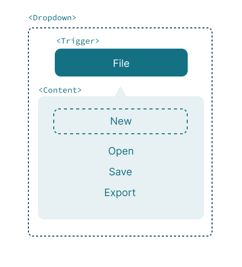
Suppose we’re creating a custom dropdown with the following markup in mind:
<Dropdown.Root>
  <Dropdown.Trigger />

  <Dropdown.Content>
    <Dropdown.Item />
    ...
  </Dropdown.Content>
</Dropdown.Root>
When building this kind of component there are some things to consider:
- How to toggle the dropdown content by a trigger(button) or click outside.
- Focus management between the content and the trigger.
- Accessibility, e.g. managing aria attributes when toggled on or off.
- Keyboard interaction inside the content.
These are just some essential requirements we need to meet to create a functional and accessible dropdown component. As you might notice each sub component that exists in our dropdown needs some sort of relationship between each other and the root.
Compound components create a relationship between a group of components by managing and providing state and logic. The way this works is by injecting the state with a DropdownContext provider wrapped around its children with the necessary actions and behaviors:
const DropdownContext = React.createContext()

function Dropdown({ children }) {
  const [open, setOpen] = useState(false)
  const toggle = () => setOpen((prevOpen) => !prevOpen)

  return (
    <DropdownContext.Provider value={{ open, toggle }}>
      {children}
    </DropdownContext.Provider>
  )
}
In order to subscribe to the DropdownContext context every component must be a child of the root dropdown component to consume its state. The following example uses this context to toggle the dropdown visible and its accessible state.
function Trigger(props) {
  const { open, toggle } = useContext(DropdownContext)
  return (
    <button type="button" aria-expanded={open} onClick={() => toggle()}>
      {props.children}
    </button>
  )
}
Next, we create a basic content component for our dropdown that exits when you hit the escape key, like so:
function Content(props) {
  const { open, toggle } = useContext(DropdownContext)
  return (
    open && (
      <div
        role="menu"
        onKeyDown={(e) => (e.code === 'Escape' ? toggle() : null)}
      >
        {props.children}
      </div>
    )
  )
}
Compound components are a good solution to handle multiple components that depend on the same state and behaviors to allow them to work as a single unit, in other words, components that are meant to work together. This gives us a better separation of concerns between what rendering logic each child needs and what internal state they can access from the parent.
Jump to headingControlled and Uncontrolled components
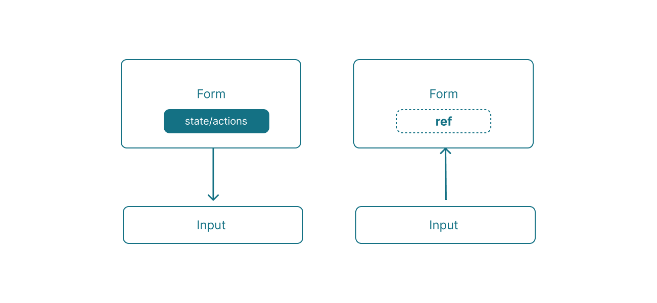
Aside from rendering and composing patterns we often see components being controlled in different manners. Components that are usually driven by props rather than their own local state are controlled.
For instance, we can dictate the value and the action behavior of an input element by using the framework state mechanism, as in React:
const [value, setValue] = useState('React')
<input type="text" value={value} onChange={handleChange} />
On the other hand, while every framework gives its own abstraction and control over the component, we can still access the direct element state as a plain DOM element.
This is so called a uncontrolled component where the source of truth is actually within its own state, the DOM manipulates where the value is or what the event or action does internally. They are usually accessed via a ref that can access the underlying DOM element:
const inputRef = useRef(null)
<input type="text" value="Components!" ref={inputRef} />

inputRef.current.value // 'Components!'
Refs allow us to keep track of the element’s current status as it can also be modified by external sources, but also programmatically focus a form element or mount a 3rd party-library for that element. This can be done by forwarding ref to child components as in React or Vue.
It is important to notice that they don’t compete with each other, you can use one pattern over the other or use both, moreover than not most components are going to be controlled and somewhat uncontrolled.
Jump to headingWhat’s next?
As lego makers invest their time to craft the most solid and well-crafted pieces to the their consumers, component artisans can do as well. We can assemble and compose components in very different ways, these was just a small part of it. We’re going to explore more in the next post with dynamic components, recursive components, render functions and more about component-driven design.
Stay tuned!