CSS is one of the three Pillars of Modern Web Development, it has evolved a lot in the past years both in terms of features and technologies going from preprocessors to CSS-in-JS, CSS modules, and PostCSS. Write good and maintainable CSS code requires study and practice.
In this article, we’ll deep dive into custom properties and possibilities for creating and composing layouts with ease.
Jump to heading Custom Properties
Custom properties (or CSS variables) are properties defined on a element with some arbitrary value that you can reference somewhere else on the document. They start with a reserved -- prefix and can be accessed using the css var() function. The var function accepts a property name and a optional fallback value, for when the property is not defined.
var(<custom-property-name>, <fallback-value>)
body {
  --bg-color: hsl(0, 0%, 96%);
  background-color: var(--bg-color, #fff);
}
Custom properties have some unique characteristics:
- They can be cascade and inherit;
- They are case-sensitive;
- They can be reassigned with a new value;
- They can be used inside a
styleattribute; - Then can also be read and set via CSSOM (JavaScript);
What is valid or not:
.fade-in {
  transition-duration: 1s;
  transition-duration: var(--duration, 0.5s);
  opacity: 0;
}
A custom property can have up to 4 possible values:
- If a custom property is defined, then property value will be whatever the value currently is.
- If a custom property is not defined, then the property value will be the fallback value (0.5s).
- If a custom property is defined with a not valid value, then the property value will be the same as unset (0s).
- If custom properties are not supported (e.g. IE 11), then the property value will be the default value or the previous declared one (1s).
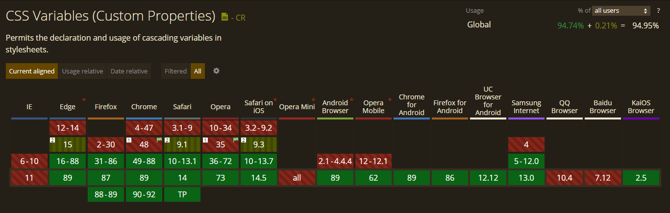
At the time of this writing, CSS Variables are supported in all major browsers:
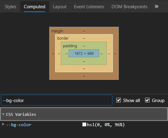
Once you define a property on a given element, you can view and debug on the browser devtools, for instance on chrome you can check on the computed tab.
Jump to heading Style Scope
Custom Properties can be defined within a large scope or a component/element (small) scope.
Properties defined under the :root element have a large scope and can be accessed and shared with any element inside of the html document. It’s commonly used to keep generally purposed properties that can be used throughout your document such as brand colors, spacing, typography, shadows, and even images.
:root {
  // colors
  --color-primary: hsl(240, 76%, 67%);
  --color-accent: hsl(33, 66%, 49%);

  // typography
  --text-sm: 0.875rem;
  --text-base: 1rem;
  --text-lg: 1.125rem;
  --text-xl: 1.25rem;
  --fw-normal: 500;

  // shadows
  --shadow-sm: rgba(0, 0, 0, 0.1) 0px 1px 3px 0px;
  /* ... */
}
Putting all of the variables under the :root selector would allow us to redefine them with new values later on, for example when a new theme is added. In this way, we don’t have to change in every place where the variations are being used, but only the actual value of the custom property.
Avoid mutating frequently a property defined in a large scope to minimize the performance cost of repainting.
But we can also define properties per component scope, which is particularly useful to make our components isolated, self-contained, and more maintainable. Take for instance a generic text field, it can have many possible variants such as valid, invalid, full, multiline, with icon, and so on.
.input {
  --input-border-color: #ced4da;
  --input-border-radius: 4px;
  --input-shadow: 1px 1px 1px inset #ced4da;
  --input-maxwidth: 30%;

  border: 1px solid var(--input-border-color);
  border-radius: var(--input-border-radius);
  box-shadow: var(--input-shadow);
  width: max(160px, var(--input-maxwidth));
}

.input--invalid {
  --input-border-color: #f52922;
}

.input--full {
  --input-maxwidth: 100%;
}
We only reassign to the values we need, this offers better style encapsulation since our variants do not have to know the properties defined.
Jump to heading Dynamic values
Unlike Sass variables, custom properties are dynamic which means we can redefine a variable and see the values being automatically generated on the fly without having to recompile our files.
.button {
  --shadow-opacity: 0.15;
  --shadow-offset: 1px 4px;
  --shadow-blur: 8px;
  --shadow-color: 144, 50%, 50%;

  box-shadow: var(--shadow-offset) var(--shadow-blur) hsla(var(--shadow-color), var(--shadow-opacity));
  /* ... some styles */
}

.button:hover {
  --shadow-opacity: 0.5;
  --shadow-blur: 10px;
}

.button:focus {
  --shadow-opacity: 0.3;
  --shadow-blur: 0 4px;
  --shadow-offset: 0 0;

  outline: 0;
}
Here we are using --shadow-color and --shadow-opacity as an argument to the hsla color function and then we reassign some of these properties based on different states, so when it changes, the box-shadow color value gets updated automatically.
Our final result:

Jump to heading Property Composition
Custom properties can be also composed based on another existing css variable, for example:
:root {
  --border-width: 1px;
  --border-style: solid;
  --border-color: rgba(0, 0, 0, 0.1);
 --border: var(--border-width) var(--border-style) var(--border-color);
}

.component {
  border: var(--border);
}
However, even though we can inherit and redefine a property declared previously under a :root scope inside a child component that does not mean the computed value (border) will be updated as well.
.component {
  --border-color: #eb4c4c;
  --border-width: 2px;
  --border-style: dashed;

  // Since this on another scope, this will NOT be recalculated
  border: var(--border);
}
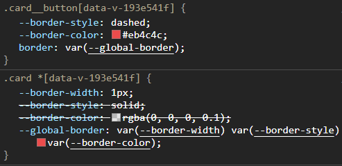
Usually, if you need to have the same computed properties defined on the parent scope be accessible and editable on child elements, you would have to use a wildcard * selector, which is essentially the same as creating the same property for each child.
.card * {
  --border-width: 1px;
  --border-style: solid;
  --border-color: rgba(0, 0, 0, 0.1);
  --global-border: var(--border-width) var(--border-style) var(--border-color);
}

.card__button {
  --border-style: dashed;
  --border-color: #eb4c4c;

  /* Gets computed to 1px dashed #eb4c4c; */
  border: var(--global-border); /* this will work */
}
Jump to heading Using CSS Variables to Create Smart Layouts
Now that we have a more in-depth understanding of how custom properties work, we’re going through some useful layout and component composition patterns we can make with CSS.
Jump to heading Creating Custom Themes
One of the most popular use of custom properties is definitely for theming. In the past, creating themes would require extensive styles overrides, duplication, and different stylesheets, but with css variables, we can take advantage of using the :root scope that I mentioned before so we can easily tweak some color values and it will update anywhere these variables are being used.
:root {
  --text-color: hsl(0, 0%, 19%);
  --bg-color: hsl(0, 0%, 96%);
  --accent-color: hsl(240, 76%, 67%);
  --font: Arial, Helvetica, sans-serif;
}

body {
  background: var(--bg-color);
  color: var(--text-color);
  font-family: var(--font);
}

button {
  background-color: var(--accent-color);
}

[data-theme='dark'] {
  --text-color: hsl(0, 0%, 100%);
  --bg-color: hsl(0, 0%, 0%);
  --accent-color: hsl(145, 63%, 49%);
  --font: Courier New, monospace;
}

[data-theme='spacegray'] {
  --text-color: hsl(0, 0%, 100%);
  --bg-color: hsl(210, 28%, 29%);
  --accent-color: hsl(33, 66%, 49%);
}

[data-theme='warm'] {
  --bg-color: hsl(37, 90%, 91%);
  --accent-color: hsl(196, 97%, 49%);
  --text-color: hsl(35, 9%, 37%);
  --font: Palatino, serif;
}
Then we just add a little bit of JavaScript to allow us to switch from one theme to another interactively:
const themeControl = document.querySelector('input[name=theme]')

themeControl.addEventListener('change', ({ target }) => {
  document.documentElement.setAttribute('data-theme', target.value)
})
Headline
Lorem ipsum dolor sit amet consectetur adipisicing elit. Repudiandae inventore neque nostrum sint rerum exercitationem possimus assumenda doloremque nemo? Quis.
Jump to heading Color Palletes
calc() is a css function that receives an expression and performs a calculation between two or more values. We can use calc with custom properties to manipulate and generate new colors based on hue, saturation, or lightness.
.shades {
  --h: 360;
  --s: 50%;
  --l: 50%;
}

.box {
  --base-10: hsl(var(--h), var(--s), calc(var(--l) + 5%));
  --base-20: hsl(var(--h), var(--s), calc(var(--l) + 15%));
  --base-30: hsl(var(--h), var(--s), calc(var(--l) + 25%));
  --base-40: hsl(var(--h), var(--s), calc(var(--l) + 35%));
  --base-50: hsl(var(--h), var(--s), calc(var(--l) + 45%));
  --base-60: hsl(var(--h), var(--s), calc(var(--l) + 55%));

  background-color: hsl(var(--h), var(--s), var(--l));
}

.box:nth-child(1) {
  background-color: var(--base-10);
}

.box:nth-child(2) {
  background-color: var(--base-20);
}

.box:nth-child(3) {
  background-color: var(--base-30);
}

/* .... */
Jump to heading Managing Grid Layouts
Another good use case for custom properties is to create or define grid columns and rows. Instead of creating multiple different classes to redeclare columns, we only assign a single property and use it in our grid container.
.gallery {
  display: grid;
  grid-template-columns: repeat(var(--gallery-columns, 6), 1fr);
  grid-gap: 10px;
}
const setInlineCSS = (selector, prop) => {
  Object.keys(prop).forEach((key) => {
    document.querySelector(selector).style.setProperty(key, prop[key])
  })
}

document.querySelector('.large', () => {
  setInlineCSS('gallery', { '--gallery-columns': 3 })
})

document.querySelector('.list', () => {
  setInlineCSS('gallery', { '--gallery-columns': 1 })
})
In that way we can alternate between different layouts with just one property. It also works with media queries.
--gallery-columns: 0Jump to heading Systemize spacing
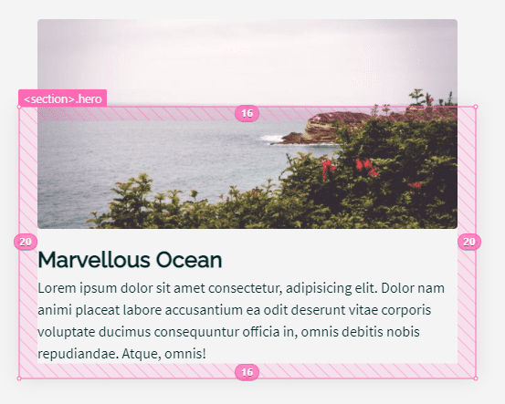
Instead of nitpicking random pixel values for margins and paddings, you can make use of custom properties to establish a space scale in your element. A defined system for spacing can significantly reduce the number of errors since you only have to choose between a certain number of values from a scale and it also makes our layout more consistent.
Start with some base values:
.hero {
  --hero-space-sm: 1rem;
  --hero-space-lg: 1.25rem;
  --hero-space-xl: 2rem;
  --hero-space-xxl: 3.5rem;

  padding: var(--hero-space-lg) var(--hero-space-xl);
}

.hero__title {
  margin-top: var(--hero-space-lg);
}
Then to make it responsive you just have to add new values to your media queries:
@media screen and (max-width: 768px) {
  .hero {
    --hero-space-sm: 0.875rem;
    --hero-space-lg: 1rem;
    --hero-space-xl: 1.25rem;
    --hero-space-xxl: 2rem;
  }
}

@media screen and (max-width: 425px) {
  .hero {
    --hero-space-sm: 0.75rem;
    --hero-space-lg: 0.875rem;
    --hero-space-xl: 1.125rem;
    --hero-space-xxl: 1.25rem;
  }
}
Tablet:
Jump to heading Controlling Animations and Transitions
Animation is a powerful tool to enhance web experience, when done right, it can really make your website stand out. Combining css variables with animation properties allows us to take control over animations with almost no usage of JavaScript.
Applying the same rules and practices we discussed before, we can add custom properties to create staggered animations, dynamically change duration, direction, easing, etc.
Jump to heading Conclusion
As we’ve seen, Custom Properties can make our developer lives much easier by building layouts effectively and consistently through particular composition patterns that can start from simple theme customization to a whole design system with colors, typography, spacing, etc.
You now have a better understanding of how to use them, how they interact with JavaScript, what are the differences in scope, composition, and some use cases. They can help us write modular and maintainable css code, which can benefit a lot of small and large codebases.