Components are the building blocks of user interfaces and the base foundation of many UI frameworks. They are not just a combination of some markup, props, and state as you need to take care of accessibility features, event handling, user interaction, styling, and testing if you want to guarantee a good user experience.
This costs time and requires a lot of effort, and research, especially when creating complex components such as Alerts, Sliders, DatePickers, and Dropdown that has many points to be covered. We tend to create the same components over and over again on every new project which can be error-prone.
You probably might be wondering, “why not use a component library?” You can definitely do that, it will work completely fine in most cases. However, those libraries are usually opinionated and come with the cost of having an entire suite of styles you would have to customize according to your design system. They also might lack some important features like keyboard navigation or not cover necessary accessibility attributes.

If you need a lightweight, full-featured accessible component with zero styling I think a low-level component might be a good suit for you.
Jump to headingWhat are low-level components
Low-level components are components designed to be starting points for most common UI components. It is designed to have all the common functionality you would expect, baked in accessibility features, and with lower to zero extra stylings. They are usually uncontrolled but can be extended with your own props and state.
Basically, you are in control of how your component is going to look, feel, and where it will be placed in your app.
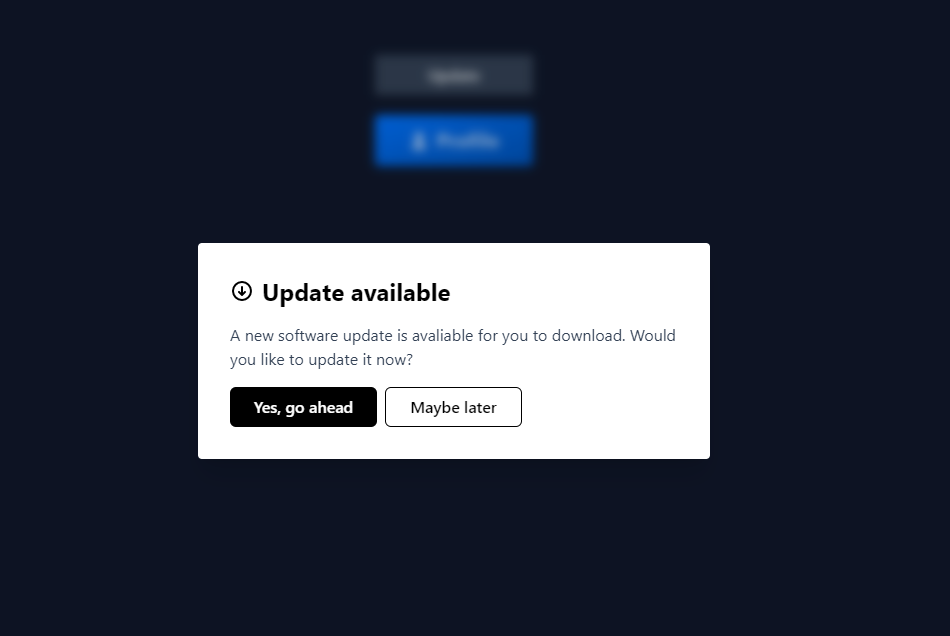
Following the next example, we have a fully functional alert component done using Radix as structure and Tailwind as its styling solution.
const SystemUpgradeAlert = () => (
  <AlertDialog.Root>
    <AlertDialog.Trigger className="text-slate-100 bg-slate-700 py-2 px-5">
      Update
    </AlertDialog.Trigger>
    <AlertDialog.Portal>
      <StyledOverlay />
      <AlertDialog.Content className="bg-white rounded fixed inset-2/4 -translate-y-1/2 -translate-x-2/4 w-full max-h-fit max-w-lg p-8 shadow-xl">
        <AlertDialog.Title className="text-2xl font-bold mb-2 inline-flex justify-center items-center gap-2">
          <UpdateSVG />
          Update available
        </AlertDialog.Title>
        <AlertDialog.Description className="py-2 mb-2 text-slate-700">
          A new software update is avaliable for you to download. Would you like
          to update it now?
        </AlertDialog.Description>
        <AlertDialog.Action
          asChild
          className="h-10 px-6 font-semibold rounded-md bg-black text-white mr-2"
        >
          <button type="button">Yes, go ahead</button>
        </AlertDialog.Action>
        <AlertDialog.Cancel
          asChild
          className="h-10 px-6 font-semibold rounded-md border border-black text-black"
        >
          <button type="button">Maybe later</button>
        </AlertDialog.Cancel>
      </AlertDialog.Content>
    </AlertDialog.Portal>
  </AlertDialog.Root>
)
Jump to headingControlled vs Uncontrolled components
Changing the topic a little bit, when I say uncontrolled components I’m talking about components that are driven by their own state which means they can be handled without a restriction of a framework. They are usually accessed via ref that references the direct HTML element, much like a DOM element.
For instance, in React world it’s common to retrieve data of form elements like <input> by passing down just a ref to it:
const inputRef = useRef(null)

<input type="text" ref={inputRef} />

// Use the ref to get it's value
inputRef.current.value // ''
On the other hand, controlled components are usually driven by props. A parent component specifies the behavior by passing props down to its children,
This might look more familiar to you:
<input type="text" value={value} onChange={handleChange} />
In general, you got to the choice to decide which parts of the component should be controlled and which should not.
Jump to headingRadix UI
Radix is a React low-level component library focused on user experience, accessibility, and customization. It comes with non-opinionated and unstyled base components you can build on top of. The idea is that logic is delegated to the framework leaving you to focus on how it looks adding styles, animations, and state as you need. You can use pretty much any technology you would want CSS-in-JS, CSS modules, Utility-first libraries, or Vanilla CSS.
The integration is dead simple, you do not need any new special provider or hook. Every primitive component works as a standalone package you can install.
Here’s an example:
$ npm install @radix-ui/react-dropdown-menu
Then you just need to import this component and add some styles and props on top of it:
import styled from '@emotion/styled'
import * as DropdownMenu from '@radix-ui/react-dropdown-menu'

const StyledDropdownTrigger = styled(DropdownMenu.Trigger)`
 /...
`
const StyledDropdownTrigger = styled(DropdownMenu.Content)`
 /...
`
// more and more styles...

const Dropdown = (_props) => (
  <DropdownMenu.Root defaultOpen>
    <StyledDropdownTrigger>
      <PersonSVG />
      Profile
    </StyledDropdownTrigger>

    <StyledDropdownContent>
      <StyledDropdownMenuItem>Your projects</StyledDropdownMenuItem>
      <StyledDropdownMenuItem>Your repositories</StyledDropdownMenuItem>

      <StyledSeparator />

      <StyledDropdownMenuItem>Settings</StyledDropdownMenuItem>

      <DropdownMenu.Root>
        <StyledTriggerItem>Team</StyledTriggerItem>
        <StyledDropdownContent sideOffset={20}>
          <StyledDropdownMenuItem>Create new...</StyledDropdownMenuItem>
          <StyledDropdownMenuItem>Invite Members</StyledDropdownMenuItem>
          <StyledDropdownMenuItem>Team's Project</StyledDropdownMenuItem>
          <StyledSeparator />
          <StyledDropdownMenuItem>Tools</StyledDropdownMenuItem>
        </StyledDropdownContent>
      </DropdownMenu.Root>

      <StyledDropdownMenuItem disabled>Shortcuts</StyledDropdownMenuItem>

      <StyledSeparator />

      <DropdownMenu.Item asChild>
        <LogoutButton>Log out</LogoutButton>
      </DropdownMenu.Item>
      <StyledArrow />
    </StyledDropdownContent>
  </DropdownMenu.Root>
)

function App() {
  return <Dropdown />
}
So that’s the skeleton of it, and as you might notice we’re importing all primivites components exported from DropdownMenu and adding styles over it. Here’s the final result:
I think folks at Radix did a really good job describing and documenting an API for each of their component and subcomponents. This can save us a significant amount of time for building complex components from scratch when running on a difficult deadline. This works for new and existing projects as you can incrementally adopt some of those components into your existing app and Radix will fill those missing holes.
Well, that’s just for React. There are also a few alternatives to Radix you can explore:
- Reach UI: Accessible React components
- Reakit: React toolkit for building accessible UIs
- Headless UI: Unstyled and accessible components designed to integrate with Tailwind CSS
- Vuetensils: Vue’s alternative to low-level accessible components
Jump to headingOpen UI, the missing standard
Components are composed of existing HTML elements which may fulfill all your needs depending on the complexity of the component. HTML already has cool native elements like <details> which allow you to expand and collapse a block of content totally functional with no extra JavaScript, but it only has some much. There is no official guide for those fancy custom components.
Open UI is a community initiative group within W3C dedicated to researching and proposing components across the web. They’re experts that take care of the hard work of researching and adding documentation for common custom components from the HTML structure to its API design details. Specifications are based on existing UI component libraries and design systems.
It is still a work in progress project, but you take a look at the catalog of their current proposals here:
Hope we can see more of those components in the Future!
Alright, front-end folks, that’s all for now. I hope you could see the benefits of using these kinds of components, which it’s definitely nothing too complex if you use them in the right spots and they can boost your team’s development speed and improve the user overall experience significantly.